


An express delivery service from Tashkent got its brand and interface
from scratch — from the name and the mark to the app screens.
QADAM delivers groceries in minutes. We built the brand, the design system
and the product screens, so the app itself only needs to be assembled.
The service had an idea. It had nothing to show a customer.
No name, no mark, no interface. And delivery is chosen with the eyes — by the sign,
the packaging, the icon on the phone. Until that exists, the service cannot be launched,
shown to an investor or explained to a courier.
A name and a mark that read on the move
So the logo is recognised on a courier bag, on a moped and in a list of apps — at a glance.
An interface where ordering takes two taps
So a person opens the app, finds the groceries and places the order without studying the menu.
A system, not a folder of pictures
So any contractor builds a new screen or banner by the rules, not by eye.
We built the brand and the interface as one system.
Qadam means “step” in Uzbek, and the whole system is built around it: one step between wanting and having.
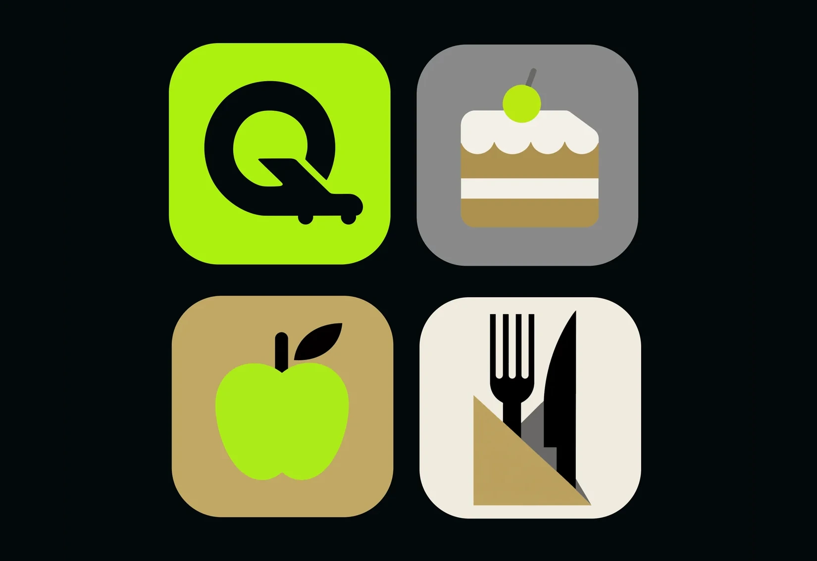
The mark is a letter Q with a trolley tail — a logo that moves. Palette, typography,
icons and screens are collected in one brandbook.
The brand stepped off the screen and onto the street.
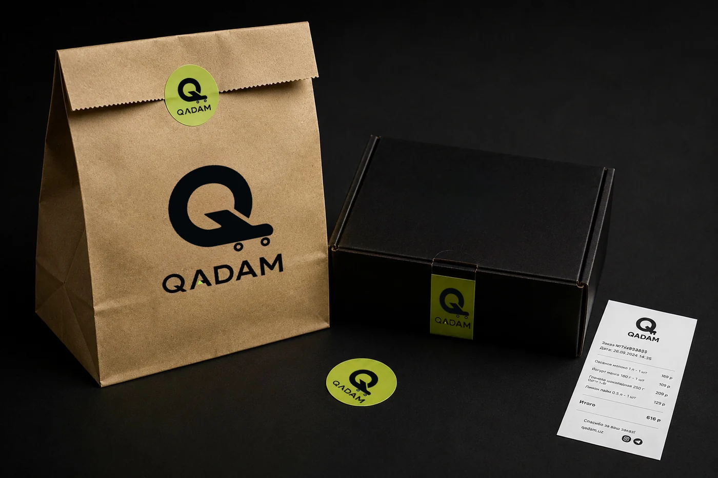
We did not stop at the logo: we built what a person actually meets —
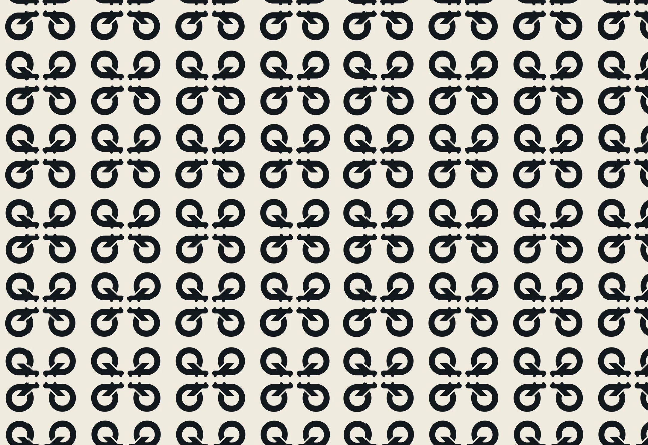
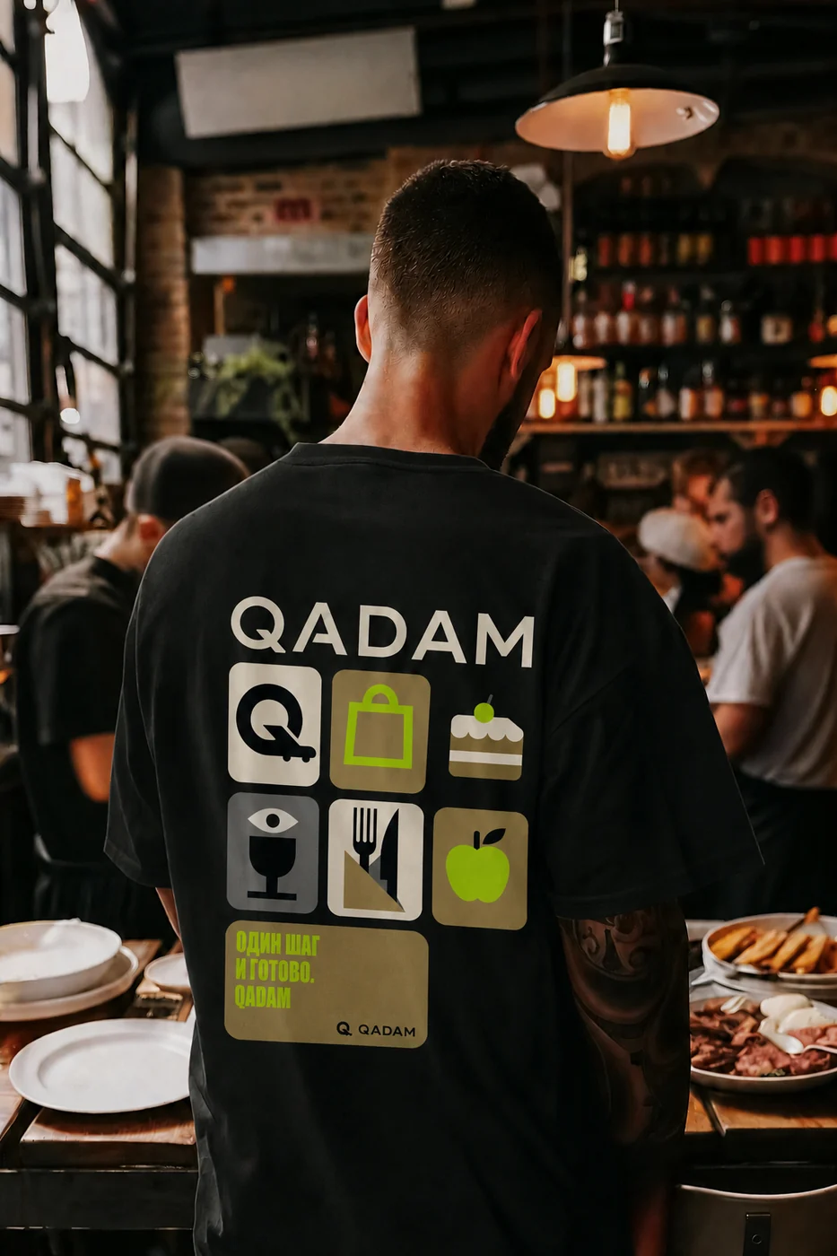
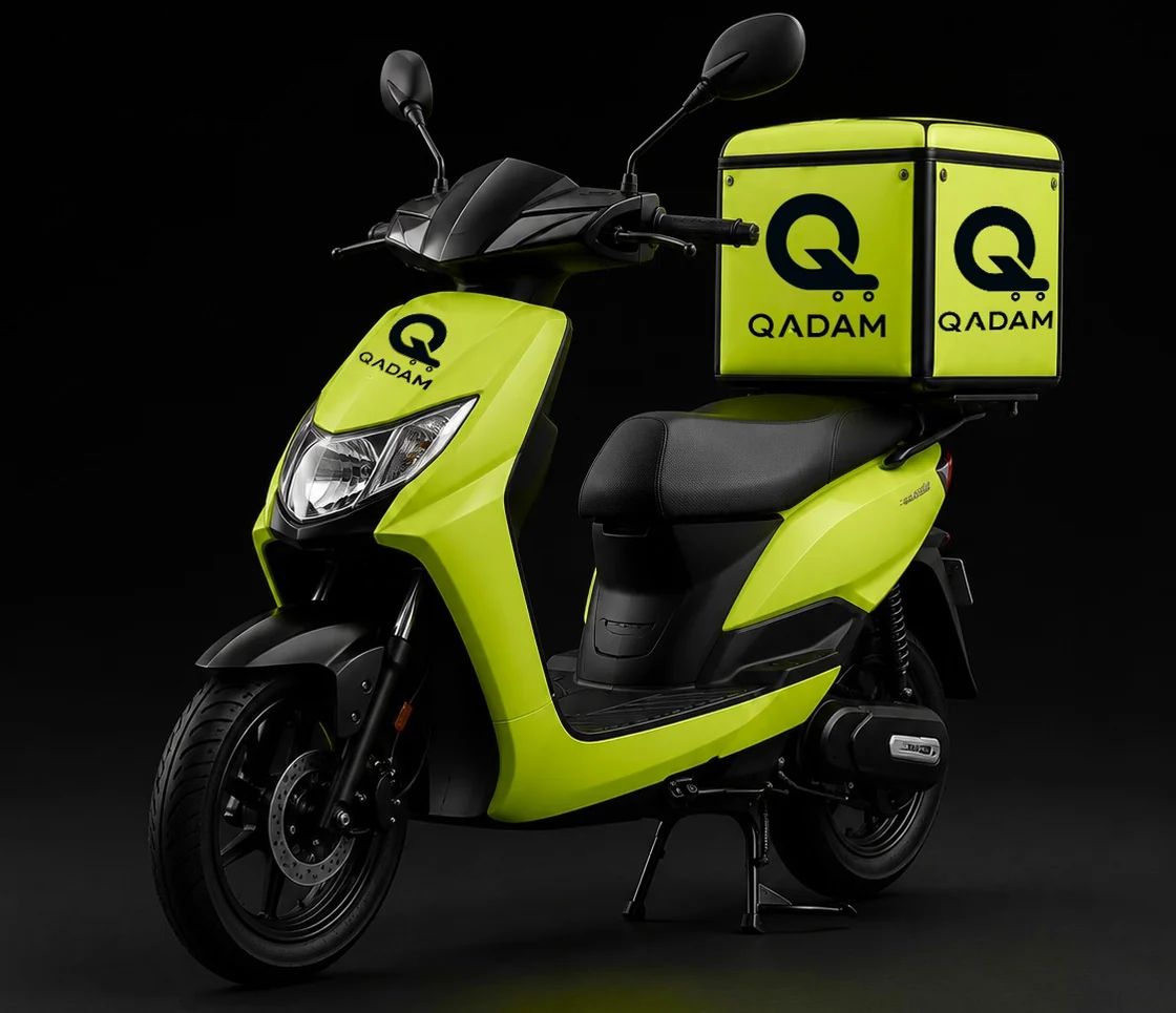
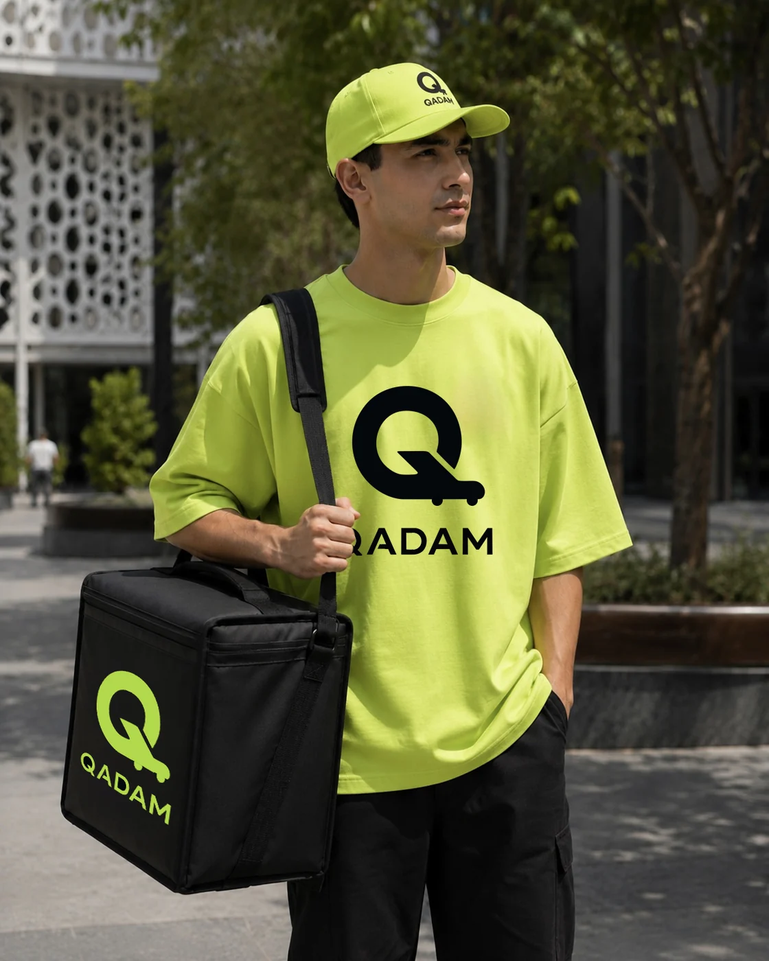
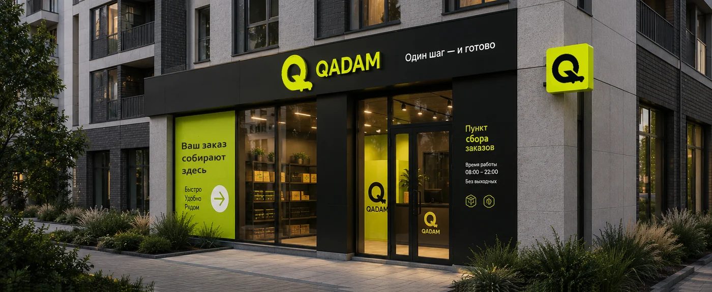
the packaging, the courier uniform, the transport, the pickup point and the brand pattern.
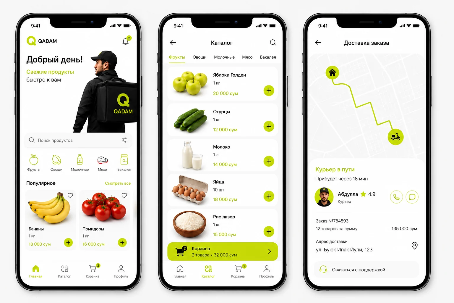
Screens that development only needs to assemble.
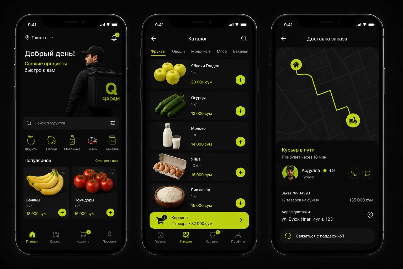
Home, catalogue and order tracking, in light and dark themes. Every state,
colour and spacing is described in the brandbook, so the front-end has nothing to guess.
We did not just draw a logo.
We built a system the product can be assembled from without a designer.
Brand, interface and carriers are described in one brandbook of 14 sections — from the mark to the courier uniform.
 One step — and it’s done
Home, catalogue and order delivery — in light and dark themes, with every state, colour and spacing described in the brand book. What is left for developers is writing the code: that was not part of this project.
QADAM is exactly that kind of project. A 14-section brand book covers everything: the mark, the app screens, packaging, vehicles, the pickup point and the courier uniform.
A logo is a small part of the system. Without shared rules for colour, spacing and states, every contractor finishes it their own way — the brand book fixes all of that for them.
“Qadam” means “step” in Uzbek. The whole system is built around this idea: one step between “want” and “done” — the same idea reads in the mark, the letter Q with a trolley-shaped tail.
QADAM started with exactly that: there was an idea, but no name, no mark, no interface. We built the name, slogan, mark, palette and app screens from scratch.
Leave your contact details,
we will get back to you
